What Makes Users Click? The Psychology Behind High-Converting Pages
Have you ever clicked on something and thought why?
Maybe the cool headline caught your eye or an eye-catchy CTA you couldn’t resist. We have all done it. We scroll, we skim and then, without even realizing it, something grabs our attention. But what makes that happen?
As it turns out, it’s not just about good looks or catchy phrases. There’s real psychology at play, nudging users to act. In this blog, we will explore what is really going on in the user’s mind when they land on a page and understand what makes them click.
1. The Power of First Impressions
Surprising as it may sound, but people form an opinion about a webpage in just 50 milliseconds. It is faster than the blink of an eye. Within the time, the person’s brain has already decided whether or not to trust the page. That’s why first impressions on a landing page aren’t just important; they’re absolutely crucial
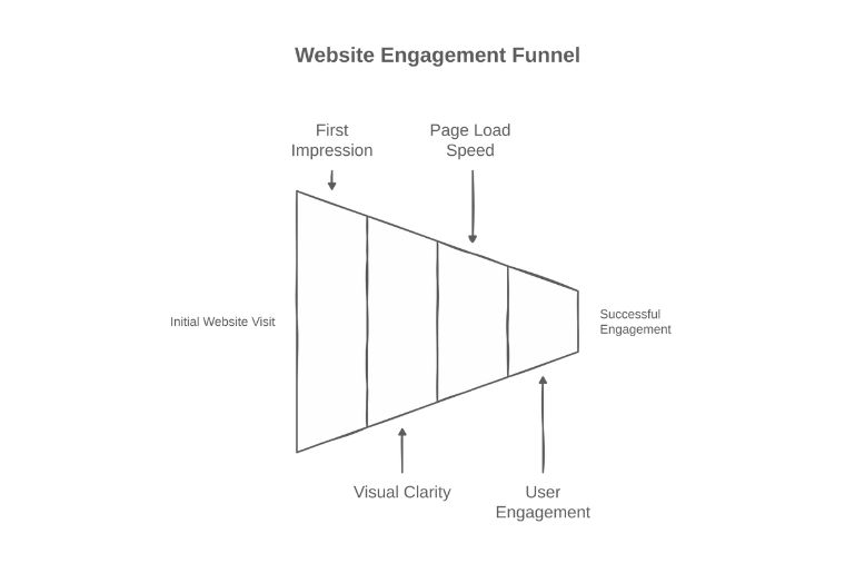
The brain is fast wired to respond to visual cues. That means layout, colors, spacing and overall clarity are not simply design choices – they are psychological triggers.
The instant uncluttered layout feels easier to digest, like this page. It takes away the cognitive overload and makes the visitor feel like they’re in the right place. Conversely, a messy page can quickly plant a seed of doubt, even if the content is strong.
Think about the last time you visited a new website. Did you stay? If you did, what caught your attention? Chances are, it was visually clear and inviting.
Visual hierarchy plays a key role here. Headlines in larger, bold fonts naturally guide the eye. Using varied font sizes, weights and colors for headings, subheadings and paragraphs provides structure to the page and is even helpful for skimmers to follow.
But visual appeal isn’t enough – Timing matters too.
Even an appealing design can’t hold someone’s attention if a page loads slowly. Slow pages sparks frustration before the reading experience even begins. On the other hand, a fast loading page builds trust and make the user stay a while.
Some of the most successful companies get this. Take Amazon, for example. Throughout their pages, they use words like “instantly” or “immediately”. These are words that light up parts of the brain, creating a sense of momentum and urgency.
2. Building Trust and Credibility
Visual hierarchy and page load speed are great. What happens next when a visitor decides to stay?
Online, where handshakes and body language don’t exist, visitors subconsciously ask: “Can I believe this? Is this offer real? Will it help me?” If the page doesn’t answer, no amount of flashy design or clever words will keep them.
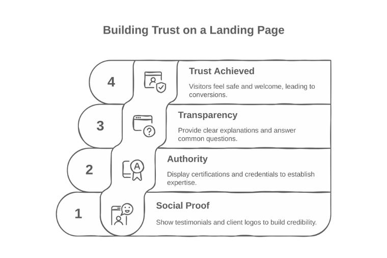
1. The power of social proof:
Our brains trust what others have already vetted. Testimonials, reviews, case studies, and logos of well-known clients signal credibility, calming the inner doubts.
For example, Monday.com does a great job at this by interweaving testimonials and client logos all over their site. In fact, they even dedicate special space to social proof, so that visitors can easily see the real experiences of others.
2. Establishing Authority:
Authority is another trust builder. Certifications, credentials, or proof of expertise reassure visitors they’re in good hands. This is crucial in fields like healthcare or finance, where credibility can make or break decisions.
3. Transparency Counts:
Trust is also built through transparency. obody likes surprises when committing time, money, or personal info.
Clear explanations in simple language, proactive FAQs, or reassuring notes next to call-to-action buttons can ease doubts and remove barriers. These small gestures show you value the visitor’s concerns.
When trust builds through these methods, the page becomes more than a sales pitch—it’s a trusted resource. Visitors feel safe and valued, making real conversions possible.
3. Tapping into User Motivation
Trust gets users to stay, but it’s not enough to make them act. The next step is addressing what drives them—their emotions and challenges.
Landing on a page that gets your struggles feels like being truly seen. That connection makes you want to explore more.
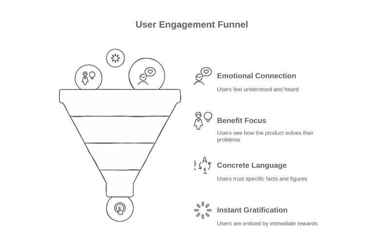
Speaking Your Customer’s Language:
Connect emotionally by using relatable words, not just good marketing jargon. A line like “Confused about why your ads aren’t working?” shows understanding of a real struggle. This cuts through generic ads and resonates on a personal level.
Focusing on Benefits, Not Features
Another interesting idea is to speak more in terms of benefits and outcomes rather than just features. Great copy doesn’t list technical details—it shows how life gets better, easier, or more fun.
For example, CloudSpot gets attention by saying “get YOUR app,” as opposed to “get OUR app.” This small shift centers the user, making the message more personal and engaging.
Using Clear and Concrete Language
Specifics build trust more than vague claims. For instance, saying “Over 3.8 million websites use Wix” is more convincing than merely calling it “the best website builder.”
Words like “instantly” or “immediately” tap into our greed for faraway instant rewards. Our brains light up when we think of getting something “right now”, lighting up the brain and boosting conversions.
This idea, when woven into a copy, doesn’t just talk to the landing page users; it hears them and listens to them, inspiring them. It creates a conversation that takes visitors from being just interested to feeling inspired to act.
4. Guiding the User to Action
Once you’ve tapped into users’ emotions and motivations, the next step is channeling that energy into action with a clear Call to Action (CTA).
A good CTA serves as a friendly invitation to the visitor; showing them exactly what to do next. When it’s simple and easy to spot, users won’t feel overwhelmed by choices.
Action-oriented words like “Get,” “Start,” “Join,” or “Discover” get people moving, while value-driven phrases like “Get My Free Guide” make the offer appealing.
Exclusivity and urgency can speed up decisions. Countdown timers or limited-time offers tap into our scarcity instinct, making the deal harder to ignore.
5. Understanding User Behavior Patterns
To create effective landing pages, you need to understand how users interact with them. By aligning with their thought processes, you can design intuitive, user-friendly pages.
How Our Brains Guide Decisions
Cognitive shortcuts or cognitive biases are the ways our brains make decisions quickly. These mental shortcuts keep us from overthinking, but they also form the way we react to information on a page. For example, more often than not, when visitors come, they don’t read every word. Their eyes scan in F-pattern, focusing on the top and left. Place key headlines and CTAs in these areas to grab attention effortlessly.
Make Content Easy to Scan
Using bullet points and clear headings breaks down information so visitors can consume it quickly. This reduces what experts call cognitive load, the mental effort needed to understand something. When a page feels simple, visitors can focus on what matters instead of getting overwhelmed.
6. The Power of Personalization
After exploring how understanding user behavior shapes the entire landing page journey, we now turn to an exciting next step: personalization. We’ve seen how content can align with a visitor’s stage in their journey, making it more relevant and user-friendly. Now, imagine tailoring each visitor’s experience in real time. Moving beyond a one-size-fits-all approach, personalization creates a unique and engaging experience for each user.
Moving Beyond Generic Experiences
Personalization is about creating a unique experience for each user based on what you know about them.
For example, if someone clicks through from a specific ad, they might see a headline that matches the ad’s message, making it feel like it was written just for them.
Instead of using the same generic welcome for everyone, it’s like calling a friend by name. Similarly, a returning visitor might see a unique message tailored to them, different from what a first-time visitor sees, making the experience feel more relevant and well-timed.
It’s also important to match the page content to the visitor’s intent. Not every visitor is ready to buy. One might be ready to commit, the other might be looking for information.
The way that technology enables this personalization is fascinating. For example, Smart Traffic applies AI to determine which variant of the landing page is best for each visitor. Brands that have used this approach have seen their conversion rates increase by 30%.
Social proof and benefits can also be tailored to different audiences. A visitor seeking budget-friendly options might see value-focused testimonials, while someone interested in premium services could be shown case studies highlighting quality and expertise. By delivering highly relevant content, personalization reduces the effort visitors need to find what they’re looking for, lowering the mental workload discussed earlier and making it easier for them to convert.
Building on Behavioral Insights
This all draws directly on what we found in terms of behavioral insights before. As marketers watch different users interact with a page—what they click on, how long they stay or don’t stay and what they ignore—they can fine tune personalization to be all the more effective. This is where conversion rate optimization tools (CRO) enter the stage. With these tools you can identify friction points, test variations and automate changes based on real time behavior, making personalization scalable and smarter. With the right tools, every visit provides an opportunity for learning and to better results.
Conclusion:
Every element of a landing page—first impressions, trust-building, and motivation—drives the conversion process. High-performing pages combine intuitive design, compelling calls to action, and a deep understanding of user behavior. By leveraging insights into how users think, scan, and decide, marketers can create experiences that resonate and guide visitors toward action with clarity.
The best landing pages are never static; they evolve through relentless testing, learning, and refinement. Every adjustment—whether to layout, copy, or calls to action—should be grounded in data and behavioral insights. With the right mindset and tools, anyone can craft landing pages that don’t just draw visitors but transform them into meaningful conversions.
This is a guest post, contributed by Vidhatanand, CEO of Fragmatic.